Moscow Chamber of Commerce launches rebrand
Effort designed to promote shared purpose and vision of chamber and visitors center
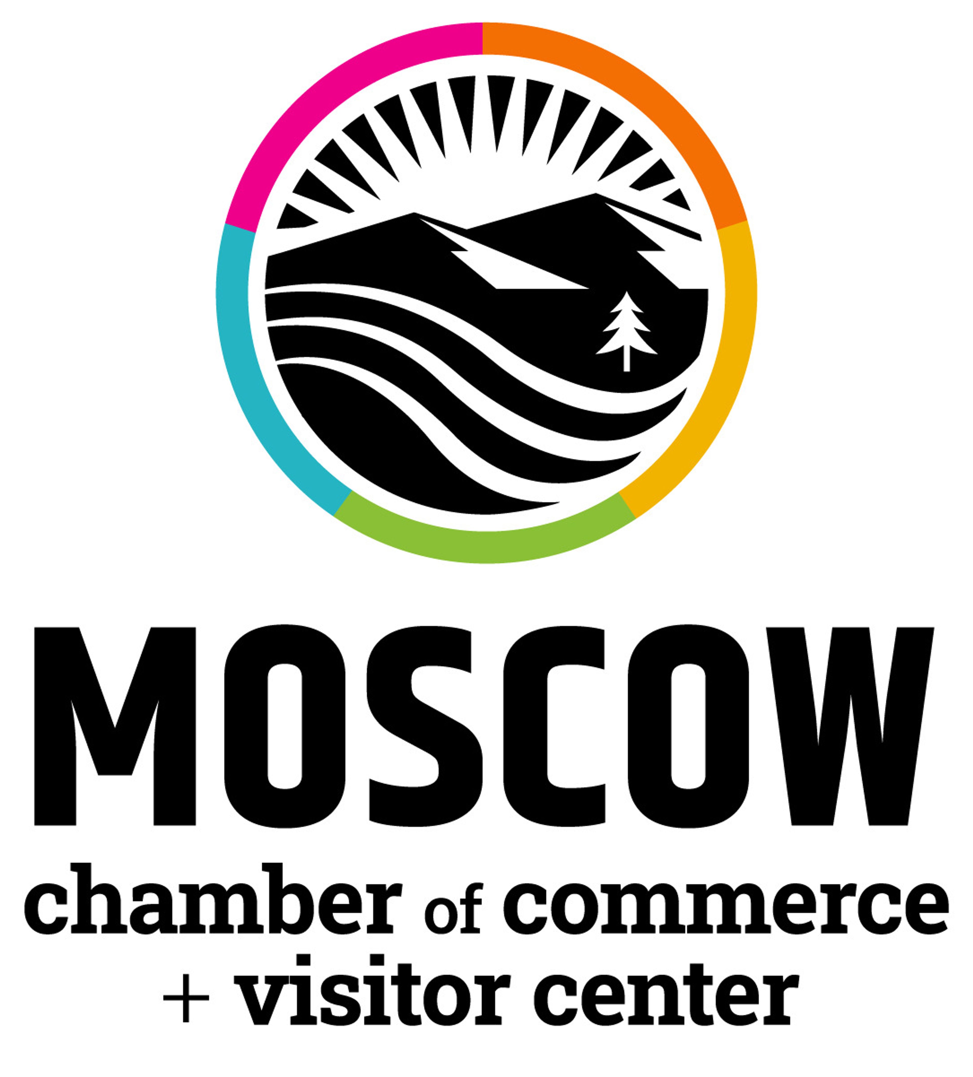

The Moscow Chamber of Commerce announced this week it will set aside its white and red checkerboard logo in favor of a circular depiction of a sun cresting rolling hills reminiscent of the Palouse.
The move is part of a rebranding effort chamber leadership says is intended to help bring together the complementary functions of the chamber and the visitors center, each located in a downtown space on Moscow’s Main Street.
Chamber Director Sam Martinet said when she took over as director in February, she noticed the visitors center and chamber operated like two separate businesses, even though “there’s a lot of synergy between the travel and tourism, community development, livability and what we do to support businesses.”
She said the effort leans into the “Visit Moscow” brand developed for the visitors center a few years ago to help merge the two entities into one cohesive whole.
Martinet said the effort was centered around a series of keywords chamber leadership felt would help tell the story of the town: connectivity, vibrancy, community, engagement and business advocacy. They then sought the help of longtime Moscow resident Ethan Coy, who now runs a freelance design company out of California called Employee of the Month. She said Coy’s company has worked on other rebranding efforts in Moscow, including developing a fresh brand for the former Prichard Art Gallery across the street when it shifted to its new identity as Moscow Contemporary.
“We want to really showcase what it means to be Moscow ... the sun coming up over the mountain really articulated for us the vibrancy of our community, and who we are, with the rolling hills in the front,” she said. “Then we really wanted to brand ourselves as Idaho, but we didn’t want to use the shape of this state, because we feel like a lot of people do that, so that’s how we came up with the idea of adding a pine tree.”
Martinet said the color wheel that rings the logo is the same color palette used for the Visit Moscow branding attached to the visitor’s center. She said there’s a lot of excitement behind chamber activity right now and the rebranding effort helps to share that enthusiasm with the wider community.
“We just welcomed five new board members, we just elected our new board president, Tracy Hacker, and everybody is just very excited about our community and transition,” she said. “We just feel like the brand refresh was a great way to share our excitement with the community to be back out there and bringing Moscow together.”
Jackson can be reached by email to sjackson@dnews.com.